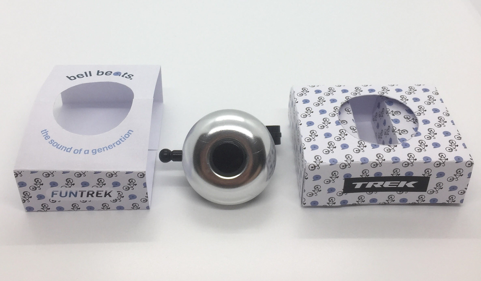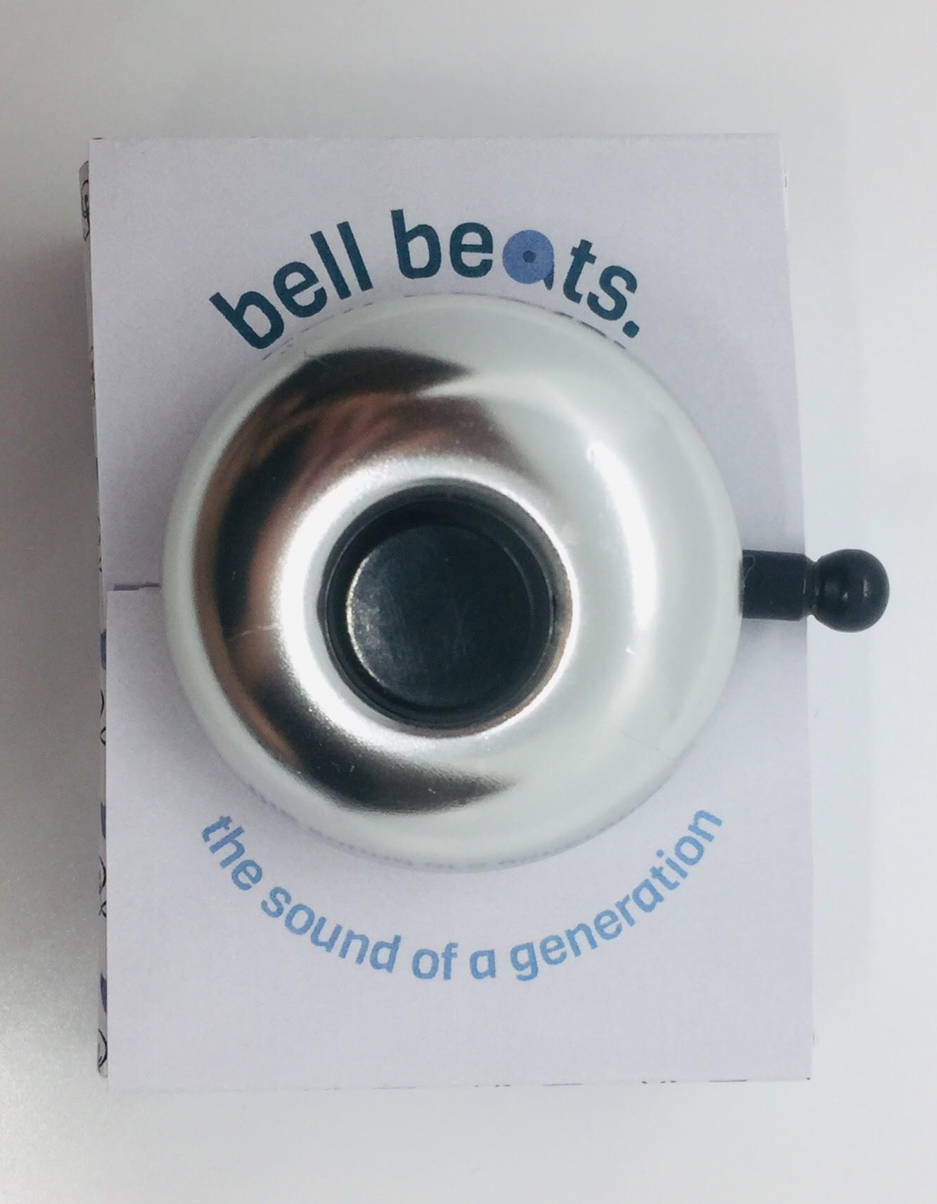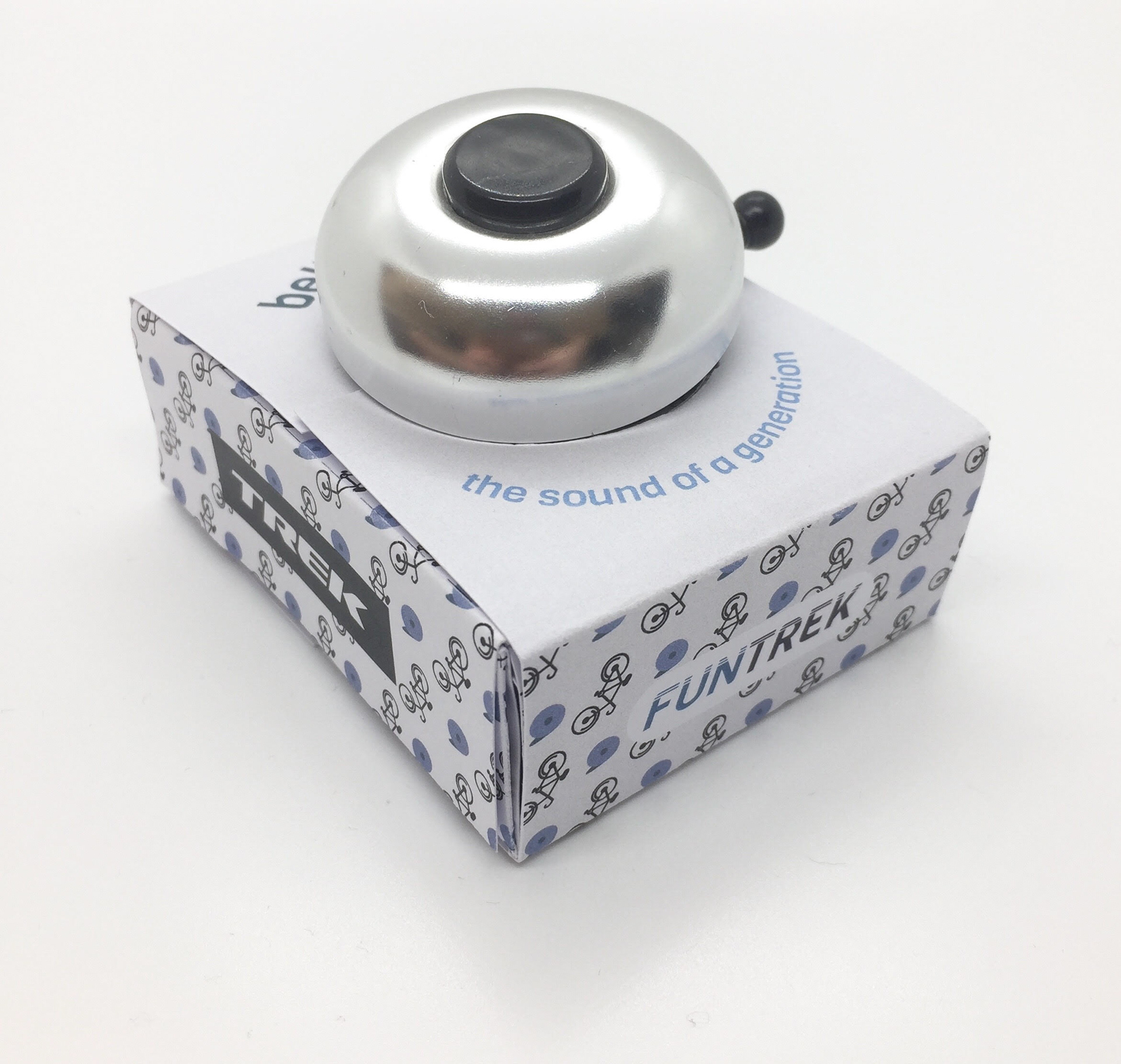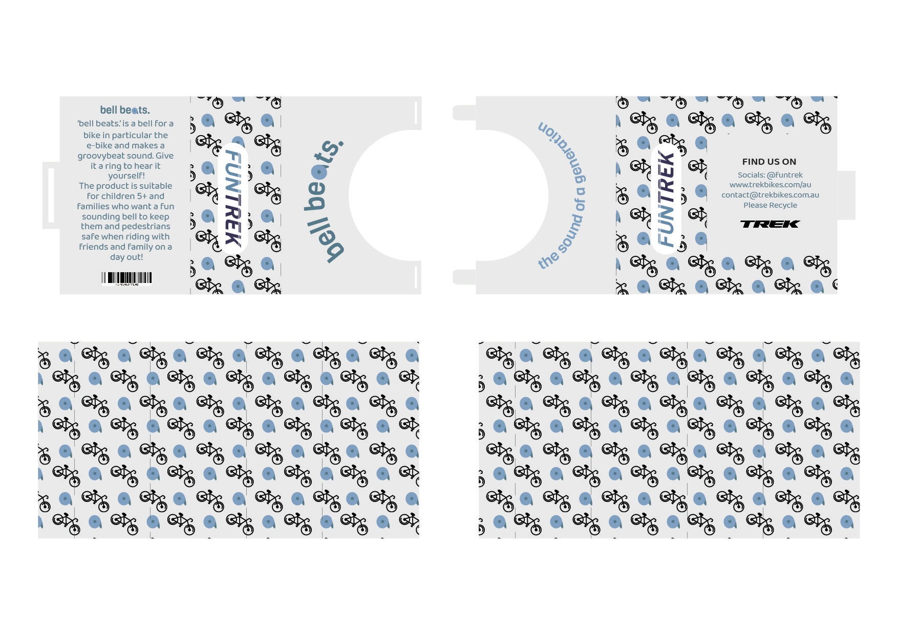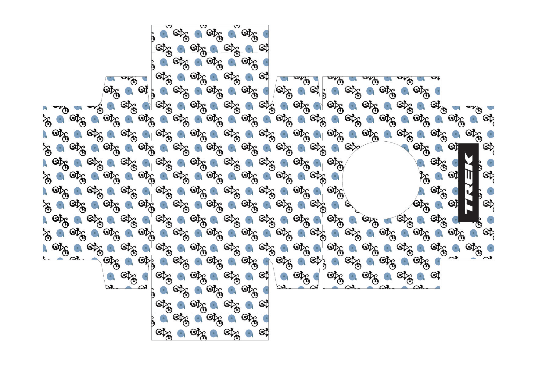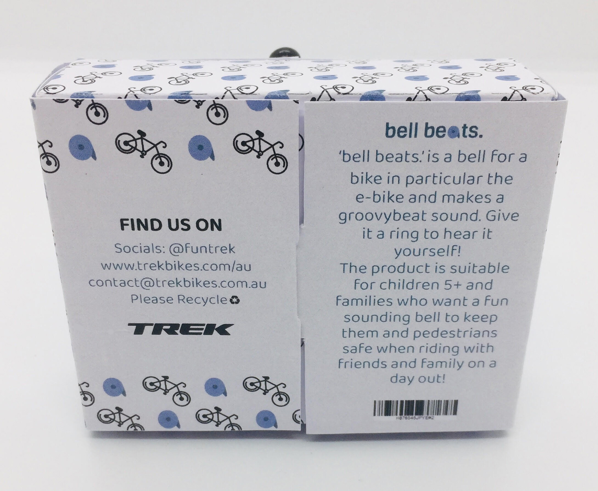
bell beats.
The name ‘bell beats.' was used as the product is a bell that makes cool and quirky beat sounds when you ring it while riding your bike. The aim of the design was to communicate to consumers to know that this is no ordinary bell and is one of a kind and that's why my packaging is around the customer being able to ring and touch the bell.
The reason blue was the main colour inspiration for the package logos and design was because it related back to Treks origin which was that it was first established in Wisconsin, America. Blue is used in the American Flag so I thought it would be a thoughtful feature to include into the designs.